


Technical leadership requires more than just writing clean code; it demands a clear vision of how systems interact, evolve, and scale. One of the most critical tools in a technical lead’s arsenal for visualizing complex workflows is the Interaction Overview Diagram. Unlike other design artifacts, this specific diagram type bridges the gap between high-level business logic and low-level implementation details. It provides a macroscopic view of control flow across multiple activities, allowing architects to validate system behavior before a single line of code is committed.
In modern software development, the complexity of distributed systems often obscures the path from requirement to deployment. Technical leads must ensure that data flows correctly, decisions are made efficiently, and asynchronous processes are handled gracefully. This guide explores how to utilize Interaction Overview Diagrams effectively to reduce ambiguity, align stakeholders, and create a robust foundation for engineering teams.
Understanding the Core Concept 🧩
An Interaction Overview Diagram is a behavioral diagram within the Unified Modeling Language (UML) family. It combines the structural elements of activity diagrams with the interaction capabilities of sequence diagrams. While a standard activity diagram shows the flow of control within a single process, an Interaction Overview Diagram allows you to chain these processes together.
Think of it as a roadmap for the system’s logic. It answers questions like:
- How does the system transition from user authentication to order processing?
- What happens when a payment service returns a timeout error?
- How do background jobs interact with the primary user request flow?
For a technical lead, this visualization is not merely documentation; it is a validation mechanism. It forces the team to confront edge cases and control flow branching that might otherwise be overlooked during early sprint planning. By mapping these interactions, you reduce the cognitive load on developers who need to understand the broader context of their specific modules.
When to Deploy This Diagram 📅
Creating diagrams is a time investment. To ensure value, technical leads must identify scenarios where the complexity warrants this level of abstraction. It is not necessary to diagram every microservice or simple function. Instead, focus on critical paths and complex integrations.
Consider creating an Interaction Overview Diagram when:
- System Complexity is High: When multiple services, databases, or external APIs must coordinate to complete a single user action.
- Onboarding New Developers: When a new team member needs to understand the flow of data across the entire application rather than just a single file.
- Architecture Review: During design reviews where the team needs to verify error handling and transaction boundaries.
- Legacy Migration: When refactoring a monolithic application into microservices, mapping the old flow to the new structure is vital.
- Async Processing: When the system relies heavily on background tasks, queues, or event-driven architectures.
Using these diagrams too frequently can lead to documentation bloat, but using them sparingly on the right problems ensures they remain a high-value asset.
Core Components & Notation 🛠️
To communicate effectively, the technical lead must master the notation. Interaction Overview Diagrams rely on specific symbols that represent different states of control flow. Understanding these symbols ensures that the diagram is readable by developers, product managers, and stakeholders alike.
Here is a breakdown of the essential elements:
| Element | Visual Representation | Function |
|---|---|---|
| Start Node | Filled solid circle | Indicates the entry point of the interaction flow. |
| End Node | Filled solid circle with a border | Indicates the termination of the flow. |
| Activity Node | Rounded rectangle | Represents a specific task or sub-process. |
| Decision Node | Diamond shape | Branches the flow based on a condition (e.g., True/False). |
| Merge Node | Diamond shape | Combines multiple flows back into a single path. |
| Fork Node | Thick horizontal bar | Initiates parallel execution paths. |
| Join Node | Thick horizontal bar | Waits for all parallel paths to complete before proceeding. |
| Control Flow | Arrow with open head | Shows the direction of control between nodes. |
Notice the distinction between a Decision Node and a Merge Node. While they look similar, their function is opposite. A decision splits the path; a merge brings them back together. Confusing these can lead to significant misunderstandings regarding how the system handles multiple outcomes.
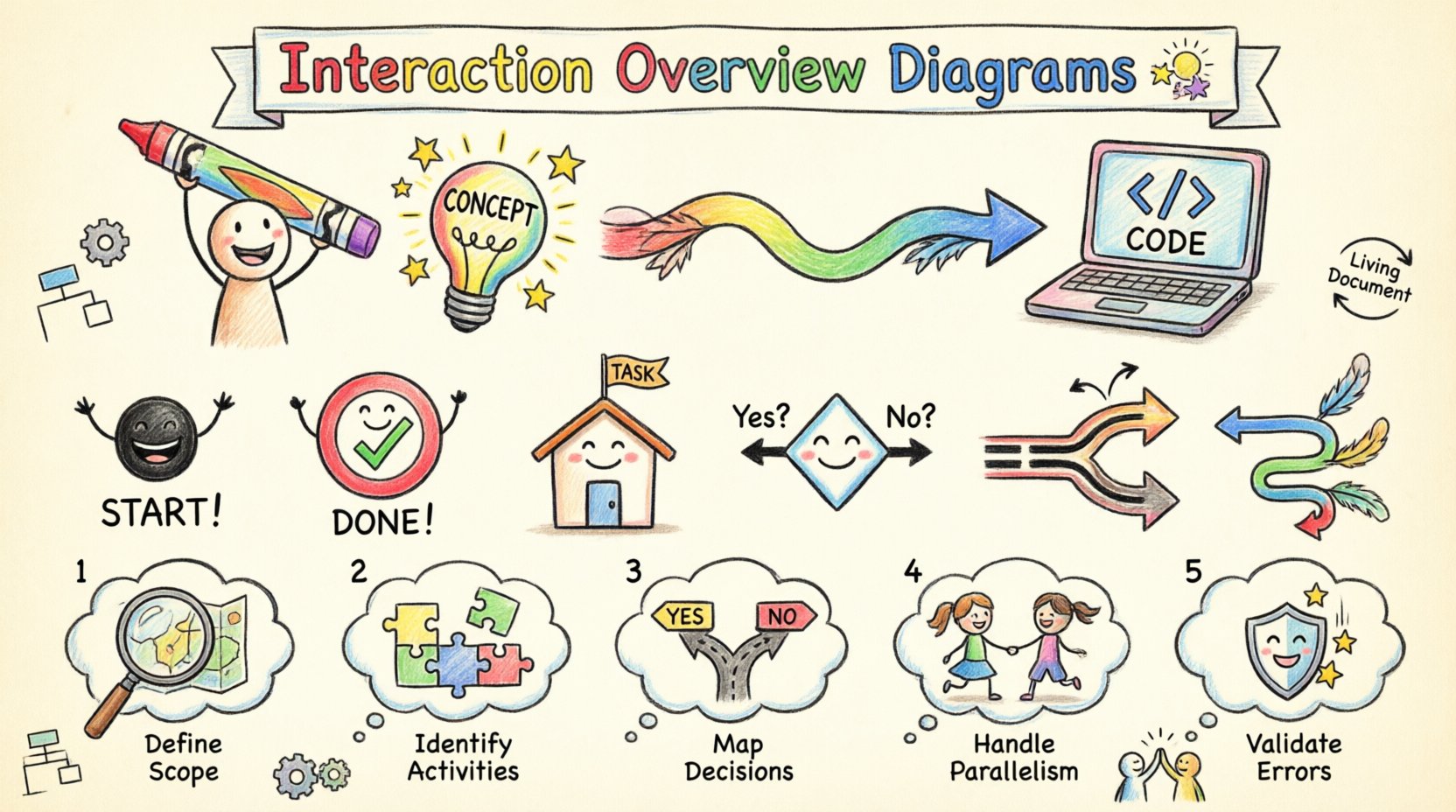
Building the Diagram: A Step-by-Step Guide 📝
Creating a robust diagram requires a methodical approach. Rushing this process often results in diagrams that are too abstract to be useful or too detailed to be maintained. Follow this structured approach to build effective Interaction Overview Diagrams.
1. Define the Scope and Entry Point
Start by identifying the trigger event. What initiates the flow? Is it an HTTP request, a scheduled job, or a message from an external queue? Clearly mark the start node. Without a defined entry point, the diagram becomes a collection of disconnected logic blocks.
2. Identify Major Activities
Break down the high-level process into major activities. These should be substantial enough to warrant their own interaction or sequence diagrams. For example, “Validate User Input” might be a small activity, but “Process Payment Transaction” is a major activity that likely involves multiple sub-systems.
Do not list every single function call. Group related operations into cohesive units. This keeps the overview diagram readable and prevents clutter.
3. Map Decision Logic
Most software systems rely heavily on conditional logic. Identify where the system makes decisions. Will the flow branch based on user roles? Will it branch based on the status of a third-party API? Draw the diamonds (decision nodes) and label the outgoing flows with clear conditions (e.g., Success, Failure, Timeout).
4. Handle Parallelism
Modern systems often perform tasks concurrently. If you have a process that updates the user profile and sends a notification email simultaneously, use Fork and Join nodes. This visually communicates that these tasks happen in parallel and that the main flow waits for both to complete.
5. Validate Error Paths
It is easy to diagram the happy path and forget the exceptions. Ensure every decision node has a failure branch. Does the system retry? Does it escalate to an admin? Does it roll back a transaction? Documenting error paths is crucial for resilience planning.
Integrating with Other UML Models 🔗
An Interaction Overview Diagram rarely exists in isolation. It serves as the glue between other modeling artifacts. Technical leads should understand how it connects with Activity Diagrams, Sequence Diagrams, and State Machine Diagrams.
- With Activity Diagrams: An Interaction Overview Diagram is essentially a specialized activity diagram. It is used when the activities themselves are complex interactions involving multiple participants. Use it when you need to show the control flow between different interaction scenarios.
- With Sequence Diagrams: The nodes in an Interaction Overview Diagram often represent entire Sequence Diagrams. You can link an activity node to a detailed sequence diagram that shows the object-level interactions within that specific activity. This creates a hierarchy of detail.
- With State Machine Diagrams: While State Machines focus on the lifecycle of a single object, Interaction Overview Diagrams focus on the flow of the system. Use them together when an object’s state change triggers a broader system process.
This integration creates a layered documentation strategy. The Interaction Overview Diagram gives the lead the “what” and “where,” while the Sequence Diagrams provide the “how” at the object level.
Common Pitfalls to Avoid ⚠️
Even experienced architects can fall into traps when designing these diagrams. Recognizing these anti-patterns early saves significant rework later.
- Over-Abstraction: If the diagram is too high-level, it loses its value as a technical guide. Developers need to see enough detail to understand the branching logic. Avoid grouping too many steps into a single activity node.
- Over-Detail: Conversely, listing every variable or database query within an activity node turns the diagram into code. Keep the activity nodes as summaries of functionality.
- Ignoring Asynchrony: Many systems have asynchronous behaviors. If you force everything into a synchronous flow, the diagram will not reflect reality. Use appropriate symbols to denote background processes or callbacks.
- Static Documentation: A diagram that is never updated is a liability. If the code changes but the diagram does not, it becomes misleading. Assign ownership for diagram maintenance just like code.
- Disconnected Flows: Ensure every node is reachable from the start node and can reach an end node. Dead ends or unreachable code in a diagram indicate a design flaw in the logic.
Maintaining Diagram Integrity 🔄
Documentation decay is a common issue in software projects. To combat this, technical leads must establish a culture where diagrams are treated as living artifacts.
Here are strategies to maintain integrity:
- Version Control: Store diagram files in the same repository as the code. This ensures they are versioned and reviewed alongside pull requests.
- Review Process: Include diagram updates in the code review checklist. If a new feature changes the control flow, the diagram must be updated before the PR is merged.
- Automated Checks: Where possible, use tools that can generate diagrams from code comments or annotations. This reduces the manual effort required to keep them current.
- Regular Audits: Schedule quarterly reviews of critical diagrams. Check if the logic matches the current production behavior. Update them if the architecture has shifted.
Treating diagrams as code ensures they remain a source of truth rather than an outdated historical record.
Facilitating Team Communication 🗣️
One of the most significant benefits of Interaction Overview Diagrams is their ability to align diverse stakeholders. Developers, product managers, and business analysts often speak different languages. A well-structured diagram acts as a universal translator.
During sprint planning, use the diagram to walk the team through the expected behavior. This allows product managers to validate that the business logic is correct without getting bogged down in syntax. For developers, it clarifies dependencies and potential bottlenecks.
When discussing technical debt, these diagrams highlight areas where the logic has become convoluted. A diagram with too many crossing lines or dense decision nodes is often a visual indicator that a module needs refactoring. This visual evidence makes it easier to justify architectural improvements to management.
Furthermore, these diagrams assist in knowledge transfer. If a key team member leaves, the diagram provides a quick reference for understanding the system’s core flows, reducing the risk of critical knowledge loss.
Conclusion
Navigating the complexities of software architecture requires precision and clarity. Interaction Overview Diagrams offer a structured way to visualize the flow of control across a system, ensuring that technical leads can communicate intent effectively to their teams. By focusing on major activities, mapping decision logic, and integrating with other models, you create a robust blueprint for development.
The goal is not to create perfect diagrams that never change, but to create living documents that evolve with the code. This approach reduces risk, improves onboarding, and ensures that the system remains understandable as it scales. For technical leads, investing time in these visualizations is an investment in the long-term health and maintainability of the software.
Start mapping your critical paths today. Identify the most complex workflows in your current project and draft an overview diagram. You may find that the act of drawing the flow reveals issues that were previously hidden in the code. This clarity is the foundation of sustainable engineering.