


Designing complex software systems requires more than just code. It requires a clear map of how different components communicate and interact. Without a structured visual representation, architectural decisions can become opaque, leading to maintenance challenges and integration failures. This is where the Interaction Overview Diagram becomes essential. It serves as a high-level blueprint for control flow, bridging the gap between static structure and dynamic behavior.
🔍 Why Visualize Flow?
Modern systems are rarely monolithic. They consist of distributed services, asynchronous processes, and intricate business logic. When architects rely solely on textual specifications, cognitive load increases. Developers spend more time interpreting requirements than implementing them. Visual diagrams reduce this friction.
An Interaction Overview Diagram offers a unique perspective. It combines the high-level control flow of an Activity Diagram with the interaction details of a Sequence Diagram. This hybrid approach allows teams to see the “what happens next” alongside the “who talks to whom” without getting lost in low-level details.
🧩 Defining the Interaction Overview Diagram
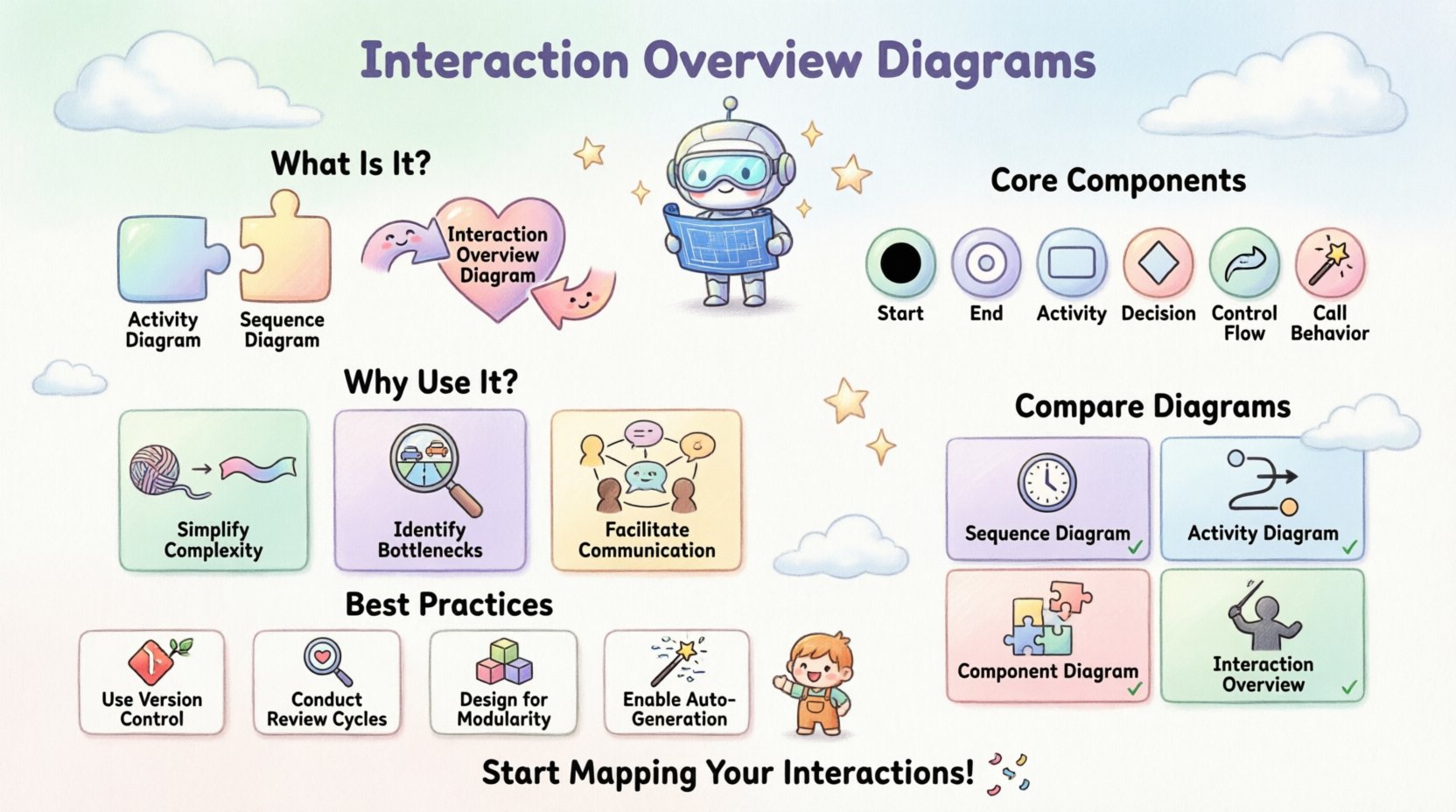
At its core, an Interaction Overview Diagram is a behavioral diagram. It depicts the flow of control between various interactions. Think of it as a flowchart where the nodes are not just simple actions, but entire interaction scenarios.
- High-Level Control: It manages the order of execution.
- Interaction Focus: Each node represents a communication sequence.
- Structural Clarity: It avoids the visual clutter of a full sequence diagram.
This diagram type is particularly valuable when designing workflows that involve branching logic, loops, or parallel processing. It provides a clear path for understanding how a system transitions from one state to another through specific interactions.
🛠️ Core Components and Symbols
To construct a meaningful diagram, one must understand the standard notation used in system modeling. While specific tools may vary, the underlying logic remains consistent.
- Initial Node: A solid black circle representing the start of the flow.
- Final Node: A circle with a smaller inner circle, marking the end of the interaction.
- Activity Node: A rounded rectangle representing a specific action or operation.
- Decision Node: A diamond shape used for branching paths based on conditions.
- Merge Node: A diamond shape used to combine multiple paths into one.
- Control Flow: Arrows connecting nodes, indicating the direction of execution.
- Call Behavior: A node that invokes a specific interaction or sequence diagram.
Understanding these symbols is the first step toward accurate architectural documentation. Each symbol carries specific meaning regarding control logic and system state.
📊 Comparison with Other Diagram Types
Selecting the right diagram for the right context is crucial. Using the wrong visualization can obscure more than it reveals. Below is a breakdown of how the Interaction Overview Diagram differs from other common architectural artifacts.
| Diagram Type | Primary Focus | Best Used For |
|---|---|---|
| Sequence Diagram | Object interactions over time | Specific message passing details between objects. |
| Activity Diagram | Workflow and logic flow | Business processes and algorithmic steps. |
| Component Diagram | System structure | Static relationships between software modules. |
| Interaction Overview Diagram | Control flow of interactions | Orchestrating complex sequences and high-level logic. |
While a Sequence Diagram dives deep into message timing, an Interaction Overview Diagram stays at the orchestration level. It tells you which sequence runs next, rather than the exact millisecond the message is sent.
🏗️ Strategic Value in System Architecture
Integrating these diagrams into the architectural process offers tangible benefits. It is not merely about documentation; it is about clarity and risk reduction.
1. Simplifying Complexity
Large systems often suffer from “spaghetti logic.” When control paths are scattered across multiple files or services, understanding the full lifecycle of a request becomes difficult. An overview diagram consolidates these paths. It allows stakeholders to grasp the entire workflow without tracing every single line of code.
2. Identifying Bottlenecks
Visualizing the flow highlights where data accumulates. If multiple paths converge on a single interaction node, that node represents a potential bottleneck. Architects can spot these choke points early in the design phase, before implementation begins.
3. Facilitating Communication
Developers, testers, and business analysts often speak different languages. A well-structured diagram serves as a universal reference point. It reduces ambiguity in requirements and ensures everyone agrees on how the system behaves under specific conditions.
🔄 Designing for Control Flow
Creating a robust Interaction Overview Diagram requires careful attention to control logic. It is not enough to draw lines; one must define the rules governing the flow.
- Guard Conditions: Every decision node needs clear conditions. Use specific boolean expressions (e.g., isAuthenticated == true) to define paths.
- Parallelism: If the system handles tasks concurrently, use fork and join nodes. This indicates where the flow splits into parallel activities and where it waits for all branches to complete.
- Exception Handling: Include paths for errors. A system that only documents success is incomplete. Define how the flow behaves when a service fails or a timeout occurs.
- Loops: While possible, excessive looping can make a diagram hard to read. Consider breaking complex loops into sub-interactions.
When designing control flow, think about the state of the system. Does the diagram account for recovery? Does it handle retries? These are questions that the visual model should answer.
🌐 Interaction Overview in Distributed Systems
In the context of microservices and distributed architectures, the role of these diagrams expands. Services communicate over networks, introducing latency and failure points that must be visualized.
- Service Orchestration: When one service triggers a chain of events across others, an overview diagram maps the orchestration logic clearly.
- Asynchronous Messaging: For event-driven systems, the diagram can show how events trigger specific interaction sequences without blocking the main thread.
- Data Consistency: Visualizing the flow helps identify where data consistency checks occur. It highlights points where a transaction might need to be rolled back.
This level of detail is critical for ensuring reliability. In a distributed environment, visibility into the control flow is often the only way to debug complex runtime issues.
⚠️ Common Pitfalls to Avoid
Even with the best intentions, diagrams can become obstacles rather than aids. Avoiding these common mistakes ensures the documentation remains useful.
- Over-Engineering: Do not try to map every single function. Focus on the critical paths. If a diagram becomes too dense, it loses its purpose.
- Inconsistency: Ensure the diagram matches the code. A diagram that diverges from the actual implementation becomes misleading documentation.
- Lack of Context: Do not isolate the diagram. Reference the component diagrams or API specifications that the interactions depend on.
- Ignoring Edge Cases: A flow that only shows the “happy path” is incomplete. Always document error states and recovery mechanisms.
📝 Best Practices for Maintenance
Software evolves. Requirements change. Code refactors. A diagram that is accurate today may be obsolete tomorrow. Establishing a maintenance strategy is as important as the initial design.
- Version Control: Treat diagrams as code. Store them in the same repository as the source code to ensure they evolve together.
- Review Cycles: Include diagram updates in the code review process. If the logic changes, the visual model must change.
- Modularity: Break large diagrams into smaller, manageable chunks. Use sub-diagrams for complex interactions to keep the main overview clean.
- Automated Generation: Where possible, generate diagrams from code annotations or configuration files. This reduces the gap between design and implementation.
🔗 Integration with Documentation
Diagrams do not exist in a vacuum. They should be part of a broader documentation ecosystem. Linking the Interaction Overview Diagram to API specifications, database schemas, and deployment guides creates a cohesive knowledge base.
- API Contracts: Reference the specific endpoints used in each interaction node.
- Deployment Guides: Note which services are involved in each part of the flow to aid deployment teams.
- Runbooks: Include the diagram in operational runbooks. When an incident occurs, operators can trace the flow to identify where the system deviated from expected behavior.
🧭 Advanced Control Structures
For highly complex systems, standard nodes may not suffice. Advanced control structures allow for more granular management of the flow.
- Interruptible Regions: Define areas where a process can be paused by external events. This is common in long-running transactions.
- Structured Activity Nodes: Group related activities into a single node to reduce clutter. This keeps the high-level view clean while allowing drill-down into details.
- Object Flow: While primarily control-focused, these diagrams can show how data objects move between interactions, clarifying data dependencies.
Utilizing these advanced structures requires a deep understanding of the system’s behavior. They should be applied judiciously to add clarity rather than complexity.
🚀 Conclusion
Building better systems is about clarity. It is about reducing the cognitive load on the team responsible for design, implementation, and maintenance. The Interaction Overview Diagram is a powerful tool in this endeavor. It provides a structured way to visualize control flow, manage complexity, and communicate architectural intent.
By adhering to best practices and avoiding common pitfalls, architects can ensure these diagrams remain valuable assets throughout the lifecycle of the software. They are not just drawings; they are strategic documents that guide the development process. When used correctly, they transform abstract logic into tangible understanding, fostering collaboration and reducing risk.
Invest time in designing these flows. The effort pays dividends in maintainability, scalability, and system reliability. Start mapping your interactions today to see where the clarity is missing.