


Sequence diagrams are the backbone of dynamic system modeling. They provide a snapshot of how objects interact over time, making them indispensable for visualizing complex workflows in software engineering. However, a diagram that is too cluttered or poorly structured fails its primary purpose: communication. Using a robust tool like Visual Paradigm, you can ensure your diagrams are not only syntactically correct but also aesthetically pleasing and easy to understand.
In this tutorial, we will explore five industry-standard best practices to elevate your sequence diagrams from simple sketches to professional architectural documentation.
1. Keep It Focused
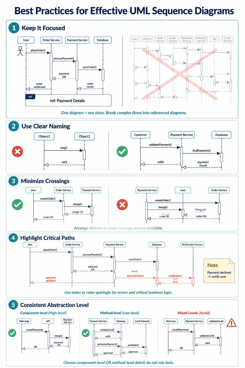
One of the most common mistakes in modeling is trying to capture an entire system’s lifecycle in a single diagram. This results in a “spaghetti” diagram where the reader loses the narrative thread. The golden rule is: One diagram = One story.
Visual Paradigm makes it easy to manage complexity. Instead of cramming everything into one massive view, use ref (Reference) fragments to isolate specific sub-processes.
ref
  title: Payment Details
  User -> Order Service: placeOrder()
  Order Service -> Payment Service: processPayment()
  Payment Service -> Database: saveOrder()
  Database --> Order Service: order saved
  Order Service --> User: order confirmed
end
By boxing a complex interaction into a ref fragment, you allow the reader to zoom in on the specific logic at a later time without losing sight of the main flow.
2. Use Clear Naming
Readability is paramount. Generic names like Object1, msg1, or ret1 force the reader to decode the logic from the context alone. This is a cognitive burden you should avoid.
When using Visual Paradigm, take a moment to rename your elements to be self-documenting:
- Lifelines: Rename “Object1” to
CustomerorPayment Service. - Messages: Rename “msg1” to
validatePayment()orfindPayment(). - Return Messages: Rename “ret1” to
validorpayment found.
This practice turns your diagram into a clear contract of interaction, where the intent of every arrow is immediately obvious.
3. Minimize Crossings
p>
Visual clutter is the enemy of understanding. When message arrows cross each other excessively, the eye gets lost trying to track which line belongs to which lifeline. This is often referred to as “edge crossing.”
The solution is simple but requires manual intervention: Reorder your Lifelines. Visual Paradigm allows you to drag and drop lifelines to find the optimal arrangement. If the logic flows naturally from left to right, ensure the arrows follow a straight path or simple curves without intersecting other lines.
4. Highlight Critical Paths
Not all interactions in a system are created equal. The “happy path” (where everything works) is important, but the error paths are often where bugs live. To make your diagram effective, you must highlight these critical branches.
Use Visual Paradigm’s styling features to distinguish error flows:
- Color Coding: Use red dashed lines for error messages (e.g.,
payment declined). - Notes: Attach sticky notes to explain complex error logic or system constraints.
By visually separating the success flow from the failure flow, you help stakeholders quickly identify potential risks in the architecture.
5. Maintain Consistent Abstraction Level
A common pitfall is mixing levels of detail within a single diagram. You should decide early on whether you are modeling:
- Component-Level (High-Level): Interactions between major services or modules (e.g.,
Web AppcallingAPI). - Method-Level (Low-Level): Interactions between specific classes or functions (e.g.,
validateCard()callingauthorizePayment()).
Avoid mixing these levels. If you start with high-level services, do not suddenly switch to low-level method calls in the middle of the same diagram. Consistency ensures the diagram remains at the appropriate level of abstraction for your audience.